Introduction to Color Psychology
Color psychology is a significant aspect of design that explores how colors influence human emotions, behavior, and perceptions. In the realm of home design, understanding color psychology is essential as it can profoundly affect the ambiance of a space and the mood of its inhabitants. Every color evokes certain feelings and reactions, which means that the careful selection of colors can create a harmonious and conducive atmosphere tailored for different functions within the home.
Historically, various cultures have attributed specific meanings to colors, signaling the nuanced relationship between color and human experience. For instance, the color blue has often been linked to calmness and tranquility, making it a popular choice for bedrooms and relaxation areas. Conversely, colors like red can stimulate energy and passion, often favored in areas designed for social interaction, such as living rooms or dining areas. These cultural interpretations highlight the importance of considering both psychological effects and historical contexts when selecting colors for home renovation.
Moreover, color preferences can vary significantly among individuals, influenced by personal experiences, cultural backgrounds, and even geographical locations. These variations point to the subjective nature of color perception and underline the importance of choosing colors that resonate with the inhabitants of a space. As one embarks on a home renovation journey, the intentional application of color psychology can guide decisions, ensuring that each room not only looks aesthetically pleasing but also fosters the desired emotional responses.
In essence, color psychology serves as a powerful tool in home design. By understanding how different colors can modify perceptions and emotions, homeowners can create spaces that are not only visually appealing but also enhance their quality of life. As we delve deeper into this fascinating subject, it becomes clear that the strategic use of color can significantly influence the overall home environment.
Color Choices in Different Spaces
The choice of color in various spaces of the home significantly influences both aesthetics and mood. Each room serves distinct purposes, and therefore, the suitable color schemes can enhance functionality while promoting desired psychological effects. Understanding the emotional responses that colors evoke is essential in creating an environment that aligns with the activities in each room.
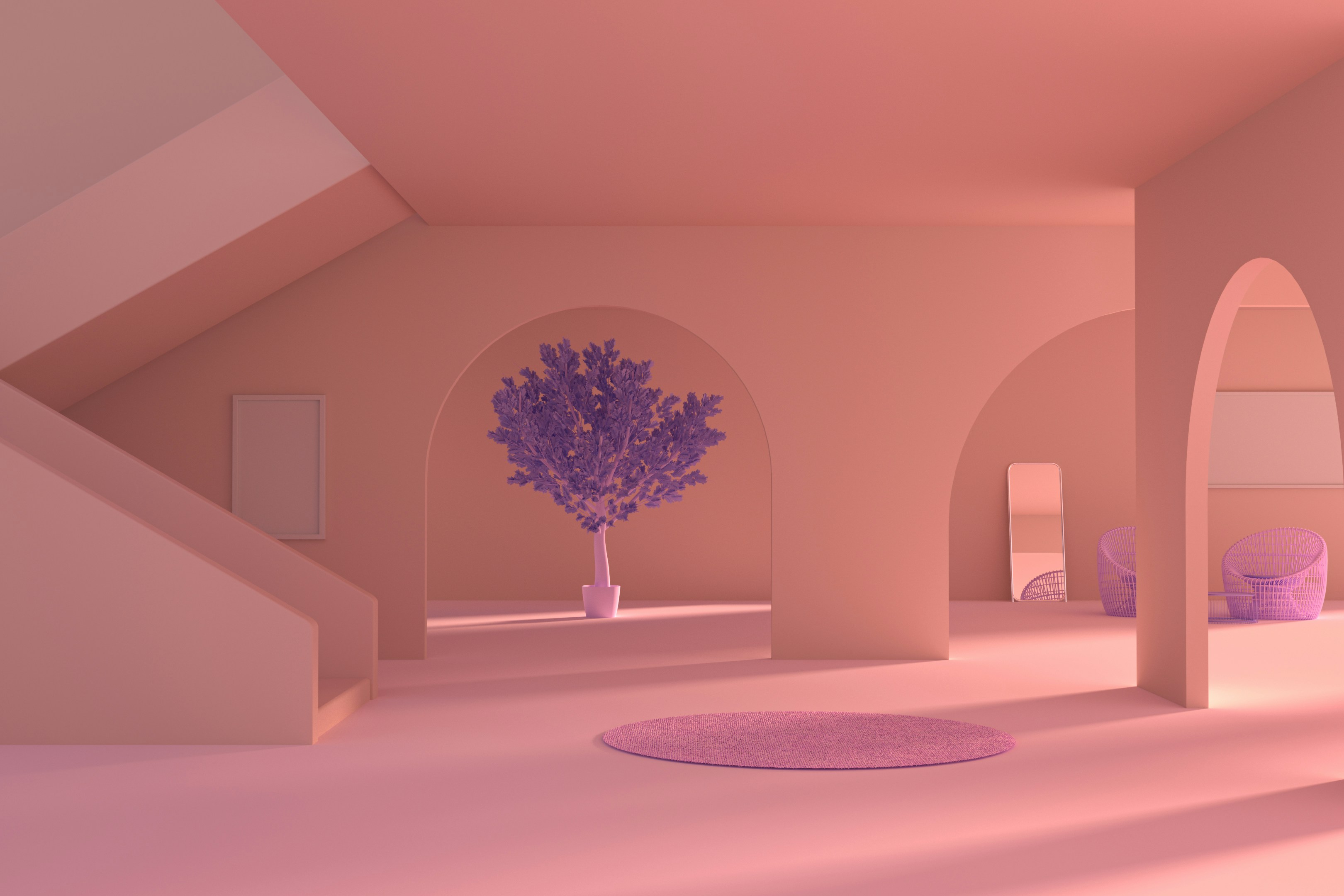
Starting with the living room, which often serves as a social hub, warm colors such as soft yellows or earthy terracotta can stimulate conversation and create a welcoming atmosphere. These colors enhance feelings of comfort and intimacy, making the living room an inviting space for gatherings. Conversely, cooler hues like blues and greens can be applied for a serene ambiance, providing a balance between energy and relaxation.
Furthermore, the kitchen, known as the heart of the home, thrives on energizing colors. Shades of red or orange can stimulate appetite and conversation, fostering a vibrant cooking environment. Meanwhile, bright whites or soft pastels can promote cleanliness and spaciousness, making the kitchen feel more open and inviting. It’s essential to choose a color that harmonizes with the overall design philosophy while also factoring in personal preferences.
In contrast, bedrooms should prioritize calmness and tranquility. Soft blues, greens, or lavenders are often recommended for creating a restful haven conducive to sleep. These colors promote relaxation and decrease anxiety, which is critical for a restful night. Furthermore, muted neutrals can also create a soothing palette that can be complemented with bolder accents through textiles or artwork.
Lastly, the home office requires colors that enhance focus and productivity. Cool tones like blue can foster concentration, while hints of vibrant colors like yellow can invigorate creativity and motivation. Balancing these color choices effectively can lead to an inspiring workspace that maximizes efficiency and well-being.
Combining Colors Effectively
Color combinations play a crucial role in the overall aesthetic and emotional impact of interior design. Understanding the principles of color theory can greatly enhance the effectiveness of color schemes within a space. One of the most essential concepts is complementary colors, which are situated opposite each other on the color wheel. When used together, they create vibrant contrasts, making each color appear more dynamic. For example, pairing blue with orange or red with green can create striking and energetic environments, perfect for engaging spaces such as living rooms or kitchens.
Analogous color schemes, which involve colors that are next to each other on the color wheel, offer a soft and cohesive look. These combinations provide a sense of harmony and can promote a calming atmosphere. An example of this would be blending shades of blue, teal, and green to create a tranquil ambiance in a bedroom or bathroom. Such schemes encourage relaxation and can be particularly beneficial in areas designated for rest and rejuvenation.
Triadic color schemes, on the other hand, utilize three colors that are evenly spaced on the color wheel. This approach can bring a sense of vibrancy and balance when executed well. For instance, incorporating red, yellow, and blue together can yield a lively space if applied thoughtfully, allowing for playful dynamics while maintaining visual order.
Additionally, the impact of trends cannot be overlooked. Current trends may influence popular color combinations, encouraging homeowners to experiment with bold pairings or lean towards monochromatic palettes. Utilizing neutral colors as a foundation can anchor more vibrant hues, allowing them to shine without overwhelming the senses. Accents in rich tones act as focal points while soft neutrals provide a backdrop of subtlety and sophistication.
Practical Tips for Color Selection in Home Renovation
Choosing the right colors for home renovation is a significant aspect of interior design, as colors influence mood, perception, and overall ambiance. To begin, it is advisable to test colors in small quantities before committing to large areas. Purchase sample paints or use color swatches, applying them to a portion of the wall to see how they interact with the room’s lighting at various times of the day. Natural daylight can significantly alter the perception of color, as can artificial lighting. Therefore, consider the type of lighting present—incandescent bulbs may warm up colors, while fluorescent lights can give them a cooler tone.
Moreover, the size of the space plays a crucial role in the effectiveness of color selection. Lighter colors tend to make smaller rooms appear larger and more open, while darker shades can create a cozy, intimate feeling in expansive areas. Therefore, when planning your renovation, it is essential to balance the color scheme based on the dimensions of each room. For instance, soft pastels may be perfect for a compact living space, while bold colors could provide the perfect backdrop for larger dining rooms or galleries.
Personal preference should not be overlooked. Select colors that resonate with your individual style or evoke positive emotions. Keep in mind current trends in interior design, as they fluctuate and adapt over time. For instance, earthy tones and muted pastels are currently being embraced for their calming effects. Taking these contemporary choices into account can inspire your selections and help incorporate modern aesthetics into your home design. Ultimately, the goal is to create spaces that reflect your personality while being functional and visually pleasing.